Friday, June 29, 2012

Richard III

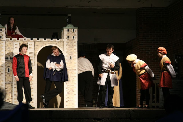
Here are some photos from Friday night's performance of Shakespeare's Richard III in Library Park by Shakesperience Productions. The weather cooled off nicely, and there was a very pleasant breeze. The performance was great, with a very powerful ending.

There will be another performance Saturday at 8 p.m. and a final performance Sunday at 2 p.m. If you like theater, or Shakespeare, or just want to try something new, go see it.

Shakesperience will also be performing The Lion, The Witch, & The Wardrobe at 10 a.m. Sunday.


Nat Angstrom as Richard III


Before going to see Richard III, I went to a special book discussion at Barnes & Noble. Shakesperience's Artistic Director, Emily Mattina, and author Joan Szechtman discussed Richard III: Fact vs. Fiction, which was perfect as a lead-in to seeing the performance.

Tuesday, June 26, 2012

Cool Waters

Waterbury's new mosaic was unveiled tonight. It is VERY cool, and a huge improvement for the wall its on and a fantastic visual for everyone coming into downtown on South Main Street. So much more inviting than a blank wall.


Kip Bergstrom, Connecticut's DECD Deputy Commissioner in
charge of culture and tourism, speaking before the unveiling.


Ta-da! "Cool Waters," inspired by the Naugatuck River, which runs through Waterbury and has been a major part of the city's history, from powering factories to destroying buildings and lives when it flooded. During the speeches, we were informed that the proposed greenway along the Naugatuck River is on the Secretary of the Interior's top 100 list of projects to see happen. The future of the river looks bright.


The panels looked bigger when they were on the Palace stage. They were mounted onto the side of 90 South Main Street by Industrial Riggers. Approximately 1200 people volunteered on the project. Very impressive! As Mayor O'Leary noted, between this and the building of the KaBOOM! playground at Chase Park last weekend, this is a very exciting time to be in Waterbury. People are coming together and making things happen.


But wait! There's more!

Artists from the Freight Street Gallery decorated the building's empty storefront on South Main Street with a few Waterbury-inspired murals. Instead of blight, we now have art.


Artist Matthew Fuller in front of his part of the mural.

Rosalind Russell, looking a bit stern.

Creative lettering, and a hint of the next mural beyond.
Stop by South Main Street to see it for yourself!

Long lines of people for the food from the various vendors.
Frankie's went through 300 hot dogs in half an hour.


Saturday, June 09, 2012

Mosaic Making at the Palace

I stopped by the Palace Theater this morning to get some photos of the mosaic project. The final product will be a very large mosaic which will be mounted to the side of a building on South Main Street downtown.


The mosaic was designed by artists Joanne and Bruce Hunter. It is made up of 60 panels, each of which measures 3 feet by 5 feet. The tiles are being adhered to the panels by hundreds of volunteers from Waterbury and the arts community (I saw a group of volunteers from Brookfield's The Art Spot today).


Volunteers have been working on the stage of the Palace Theater, seven hours a day, for nine days. The daily schedule is broken into shifts to make it easier on the volunteers and to allow more people to participate.


The mosaic will be unveiled during a block party celebration on South Main Street downtown, Tuesday, June 26, 6 p.m. to 8 p.m.


A full stage of volunteers!


The mosaic will be placed permanently on the large brick wall in the center of this
photograph, making this stretch of downtown much more appealing.

Completed panels hidden from view, so that the final design will be a surprise when it is unveiled on June 26.


The artists' design on paper and as a mosaic.


Whenever a panel was completed, everyone on stage cheered.


The process is a little bit like paint-by-numbers: each panel has the color-coded design laid out,
in many cases with the name of the color, making it easier for volunteers to figure out what goes where.


Buckets of tiles with their colorful names on the sides.


Messy work!


Where it all came from: the City of Waterbury and the Arts and Culture Collaborative (ACC) of the Greater Waterbury Chamber of Commerce Foundation were chosen by the Connecticut Department of Economic and Community Development (DECD) and the Connecticut Office of the Arts (COA) to participate in the state's City Canvases Initiative.  City Canvases is a one-time program to enhance public spaces through the commissioning of large-scale works of public art which help shape dynamic spaces and create livable, vibrant communities that attract economic development.


The project also includes numerous sponsors to cover all the costs. A total of 60 sponsorships, at $1,250 each, were available.

Wednesday, June 06, 2012

Facade Improvements

A while ago, I wrote a post about upcoming facade improvements in downtown Waterbury. The program was created by Main Street Waterbury and uses guidelines intended to upgrade building facades while preserving or enhancing the historic architectural features of the building. The guidelines also provide information about good design and improving the pedestrian experience. The program is administered by Waterbury Development Corporation.

The Facade Improvement Program is ongoing. If you own a building downtown and would like assistance to make your building look better, contact Carl Rosa at Main Street Waterbury.


Here are the before and after photos.

483 West Main Street -- BEFORE

483 West Main Street -- AFTER

Window casings repaired, paint colors match brickwork,
storefront matches the look of the building and is both elegant and inviting.


Bank Street buildings -- BEFORE

Bank Street buildings -- AFTER


58 Bank Street, Before and After

The stark white window casings have been replaced with better quality windows that blend better with the building;
lintels matching the third floor window lintels have been added above the second floor windows;
and a new storefront, with a more inviting store entrance, has been installed.
This building, incidentally, has a wonderful full-wall skylight on the third floor.


60 Bank Street, Before and After

How exciting is this? The bizarre 1960s accordion facade was removed. Hiding behind it was
a gorgeous facade, original windows intact, along with suburb architectural details.
Holes created for the installation of the accordion piece were repaired and a new storefront was added.


60 Bank Street, detail

Quill pen, ink, and scroll. From when there was a bookstore here.


60 Bank Street, detail

All this was hiding under the '60s accordion.


64 Bank Street, Before and After
Another fabulous discovery: the old Sugenheimer windows and logo were hiding behind the ugly panels. New paint colors were chosen to work with the Sugenheimer logo. The details of the pediment (the woodwork at the top of the building) really pop with the contrasting red and black paint. Much more attractive than the blah brown paint. The new storefront will be installed soon; I'm too excited about this building to wait any longer to share these images.

64 Bank Street, detail

The Sugenheimer window. Looks great, even in this rainy shot.


70 Bank Street, Before and After

New storefront, more elegant in design than the previous storefront.